Starting with a clean slate, without a lot of money, and without going crazy.
By Chris Horn
Director, University Writers Group/University of South Carolina
My graphic design professor Lew Brierley used to stand in front of the class and hold forth, sometimes about graphic design but more often about our future careers. So, along with gaining an appreciation for the simplicity of Helvetica, I heard him emphasize that we would one day find ourselves producing the same creative projects (in my case, magazines) again and again. “And as professionals, you’ll have to find a way to reinvent those tasks so you don’t get tired of doing them,” he said. “And every so often, you’ll need to reinvent yourselves, too.”
That was nearly 35 years ago, but he was right, of course. When I became editor of Carolinian, the University of South Carolina’s alumni magazine, I was eager to try out all sorts of ideas, and every edition seemed like a new adventure. But as the years rolled by, it felt like we were rounding off the creative corners and just doing the same things over and over in the same old way.
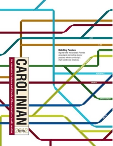
And it showed. Not for lack of trying, but many of our stories seemed uninspired; the magazine’s design was often too busy; the text was dense and uninviting. Except for the fact that it said “University of South Carolina” on the cover, the magazine wasn’t offering any great reasons for alumni to read it. And we all know that alumni don’t pay more attention to something just because it’s from their alma mater.
We knew we had to do more than put lipstick on a pig, which is what a mere redesign would have been. It was time to reinvent our alumni magazine — and reinvent the way we went about producing it.
Maybe you are in a similar place with your magazine. You want a radical change, but you’re not sure how to get there. The challenges we faced — a modest redesign budget and no time for a timeout — probably sound familiar. Everyone’s magazine redesign will look different, of course, but there are a few basic steps that will help guide the process. Here’s how we did it.
THE PROCESS BEGINS
First on our to-do list was a reader survey. Do it right, and your finger is on the pulse of your readership, and you have a baseline by which to measure future survey results.
We used a reader survey designed by CASE that allowed us to compare our data with those of several peer institutions. That gave us not only a look in the mirror at our own publication but a glimpse into what other universities’ readers felt about their respective alumni mags.
Many of our survey respondents — 85 percent — said Carolinian strengthened their connections to the university. But, although Carolinian fared better than peer magazines at other doctoral research institutions in terms of perceived quality, the attributes that received the lowest rankings were content and writing. Clearly, we were doing some things well, but we needed to find ways to give readers more of what they wanted and in ways they would find more engaging.
You go faster by yourself, but you go much further with others. If you’re really serious about not leaving any stone unturned in transforming your magazine, involve as many of your staff as you can.
After conducting the survey, our plan of action looked like this: Figure out what the new look and feel of the magazine should be and develop new approaches to storytelling, design, and photography to achieve that objective.
To get expert advice we approached Zehno, a communications consulting firm in New Orleans that we’d previously worked with on a marketing campaign. Given our limited budget, we couldn’t engage them in a conventional, wholesale way. Instead, we arranged for Zehno to consult with us for 80 hours on the redesign. Conference calls took the place of face-to-face visits, and each call ended with a specific set of tasks for everyone to carry out before the next consultation.
Next, we had to decide who on the university side to involve in the process. It was my boss’ idea to include a large cadre of our staff who weren’t directly involved with producing the magazine to ensure a broad swath of views.
I thought at first that approach was a waste of time. “Give me a good designer, a creative director, and one uninterrupted week,” I thought to myself, “and we’ll have this magazine reconcepted in a month.” But over the course of the next three months, I would learn an important lesson: You go faster by yourself, but you go much further with others. If you’re really serious about not leaving any stone unturned in transforming your magazine, involve as many of your staff as you can.
Shane Shanks, the lead editorial consultant at Zehno, adroitly guided those first conversations, soliciting ideas from everyone, entertaining every flight of fancy, without committing to anything. Everyone had an opinion, of course, and we talked candidly about the weaknesses of the current magazine — cramped, busy design, too much text, the list went on. For an editor, that process can be painful, like ripping a bandage off, but you have to do it.
IN THE MOOD
One of the fun and productive things we did early on was to dissect other magazines, everything from academic to newsstand and niche publications, looking for layouts and editorial concepts that really popped, and considering how those could be emulated or even improved upon. We compared notes with the Zehno crew and debated what might work in our magazine.
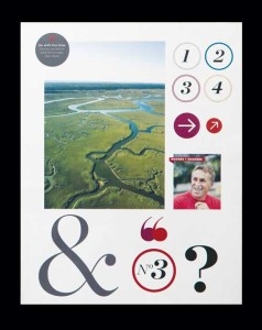
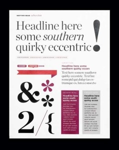
Mood boards are a great tool for sharing design ideas and establishing the look & feel for your redesigned publication.
After a few listening sessions, Zehno’s chief designer took this input and developed a series of mood boards that began to capture the essence of what intrigued all of us. The boards, which included different typographic treatments, primary and secondary color palettes, and photography styles, gave us a style to run with. Our magazine designer used them to create her own series of layouts for various magazine departments and feature stories. We found the new grid was clean and reader friendly.
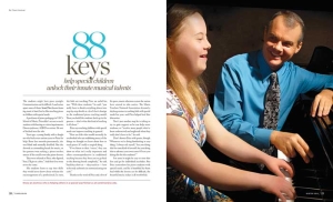
One thing was apparent to me and the other writers — the new magazine was headed for less text, bigger images that required more art direction, and more of that element every designer loves: white space. However, when the time came to put the new grid into action, our magazine designer was skeptical that we would actually write fewer words.
So, I decided proof of concept was in order. I went home one evening with a goal of shortening the brief items that appear in the opening department of the magazine. I took several pieces from previous editions and condensed them by at least one-half or more. I wanted to see how much could be cut while still retaining the kernel of what made the story interesting and worth the reader’s attention. Some briefs were reduced to only one pithy quote and an extended attribution to provide context. It worked!
I should point out that the new layout style allowed considerable flexibility on story length. Not everything had to be short. In fact, the first edition of the redesigned magazine included one of the longest stories we had ever run — and yet the new design somehow made it look slim.
We also developed a menu of new standing features like “Carolinians who run” (or “see stars” or “climb mountains” or whatever); “Head to Head,” which features short reminiscences by two alumni — one young, one not so young — on the same campus topic and illustrated with hand-sketched portraits; and Read & Repeat, a one-page collection of five factoids about the university that we want our alumni to share with others.
Along with that menu of new feature ideas, we brainstormed non-narrative approaches to telling stories and imagined new ways of casting the net to gather story ideas for each edition. We ended up with a collection of page layouts that our redesign task force and Zehno deemed ready for prime time. Now we had to get buy-in from key constituents.
THE SELL
Focus groups are tricky things. One loud and opinionated person can drown out all other voices and seemingly skew the results. Part of the trick is choosing participants wisely, avoiding bombastic personalities while getting a balance of younger and older readers and a cross section of ethnicities from your alumni base.
Our marketing research guy was a great help here. He had led dozens of focus groups and could steer the conversations and solicit opinions, teasing out valid tidbits of feedback. We watched carefully as the participants perused the layouts to see where their gazes lingered, which photos seemed to hold their attention the longest, which clever headlines elicited a chuckle. Those nonverbal cues were sometimes as revealing as what was actually said.
We did have a little hang-up over type size. Modern design often trends toward smaller type, but we didn’t want the new magazine to require reading glasses. When one of the focus groups comprised mainly of older alumni turned conventional wisdom on its ear by choosing the smaller type size, we knew we had it just about right.
We kept track of all the comments and criticisms and kept refining. By the time we showed the polished layouts to the university president, we already had endorsements from key alumni and a well-articulated rationale for every facet of Carolinian’s new look.
THE PAYOFF
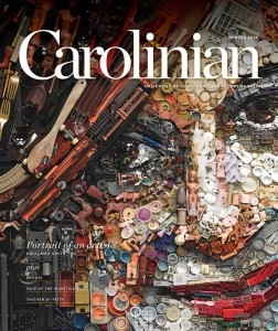
When that first carton of magazines arrived, I’ll admit we were a little giddy. Our cover portrait popped, the photography zinged, the feature stories sparkled. And the compliments poured in from all quarters.
I sent copies of the old magazine and the first new edition to Dale Keiger, the editor of Johns Hopkins’ alumni magazine and editor of UMagazinology, a blog devoted to academic mags. In a posting that included before and after photos of Carolinian, he expanded my vocabulary with a Britishism — “a dog’s breakfast” — in describing the layout of the old Carolinian (I couldn’t argue with that!). More importantly, he was generous in his praise of what we had achieved with the new magazine. The redesigned Carolinian went on to garner awards from CASE and the American Advertising Federation months later.
Sweetest of all were the many comments from readers — some by email, others by phone or in person — that validated all of the effort and time we had committed to the project. That positive feedback was reinforced in a follow-up reader survey.
We’ve produced 10 editions in Carolinian’s new format, and we find ourselves always tweaking — experimenting with different ways of storytelling; trying new photography concepts and eccentric layouts. Not everything sticks, but our goal is not to get bogged down in a creative rut. My old professor would be happy, I think. We’ve reinvented our magazine and the way we make it.
. . . . .
Chris Horn is director of the University Writers Group in the Department of Communications and Public Affairs at the University of South Carolina, his alma mater. He is editor of Carolinian magazine. Connect at tinyurl.com/linkedin-horn.
. . . . .
Join us on Twitter and LinkedIn to share your thoughts & opinions.


