By Betsy Robertson
National Account Executive/Lane Press
One of the most confounding yet ultimately rewarding aspects of creating a magazine is the journey to that “eureka” moment when words and art fit together seamlessly to capture and sustain a reader’s attention. We all know it when we see it: a cool infographic that breezily outlines a complicated financial story; a series of sketches illustrating an esoteric concept; or a lone photograph that conveys all the emotion of a 3,500-word feature arc. It’s what keeps editors and designers up at night: How do we perfectly meld art and text to create a compelling publication that keeps readers coming back for more?
Naturally, there’s no easy answer to that question. But the marketing team at the University of Central Florida has crafted a way of thinking about editorial design that more often than not hits the mark. Editorial director Eric Michael and art director Steven Webb follow two simple tenets: “To write better, think like a designer. To design better, think like a writer.”
In practice, the pair begins by completing a creative brief for the features slated for each issue of Pegasus, UCF’s award-winning alumni magazine. Webb and Michael described the process during a presentation at the University & College Designers Association’s annual conference in October in Orlando, Florida.
The creative brief—commonly used by designers to document the goals and objectives of an ad campaign or other marketing project—can also frame the context of a story, offering direction for narrative structure, artwork, and page layout. The brief is designed to answer several key questions:
- Why are we doing this story?
- Why will the reader care?
- What is the tone of the message?
- How do we engage the reader?

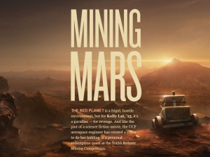
An effective creative brief gives rise to on-point results, like this dramatic feature illustration in Pegasus magazine.
At Pegasus, which mails three times a year to nearly 220,000 alumni and friends of the university, the creative brief is part of an editorial planning strategy aimed at producing a publication that endears readers to the 53-year-old institution. For a routine story on a UCF student team’s participation in a NASA-sponsored robot design competition, for example, the Pegasus team hired Los Angeles-based concept artist Kentaro Kanamoto to envision and illustrate a remote-controlled machine patrolling the surface of Mars. The resulting feature played on the idea of an epic human vs. cyborg struggle, a common plot device of science fiction novels that resonates emotionally with graduates of UCF, which was originally envisioned as a place where students could train for careers in engineering, electronics, and other professions needed to sustain the space exploration industry.
Printing on uncoated paper and measuring nearly 10 x 13 inches, Pegasus’ extra-large trim size and unusual stock also signal its creators’ commitment to be different. Its brew of illustrative typography, conceptual photography, and ambitious editorial assignments—the Summer 2015 issue featured a cover story on the changing relationship between the United States and Cuba—has garnered more than 40 awards of excellence in the last three years, including a 2014 Gold Award for college/university general interest magazines from the Council for the Advancement and Support of Education and multiple 2015 overall magazine design excellence awards from UCDA.
Click here to read Pegasus online. And, for more on the use of creative briefs to inform design projects, see this article in Communication Arts magazine.
. . . . .
Join us on Twitter and LinkedIn to share your thoughts & opinions.


