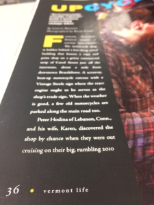
Q: I notice that white knockout type in folios sometimes looks slightly red. How can I avoid this in my magazine?
Knockout type is one of those design elements that will always look great on screen but may appear less great in print—particularly when the font is small or finely serifed. Have you ever noticed photo credits or folio text in your magazine that have a red or yellow cast rather than appearing bright white? Here’s why—and how to avoid it.
 Web presses run fast—and while amazingly stable at such speeds, there is a standard amount of shifting that occurs as the paper zips through the press. Although such shifts are minute—we’re talking thousandths of an inch—a very small design element (such as white text on a black background), can appear “out of register,” meaning some of the surrounding ink blends into the bright-white area or text.
To minimize this problem, Lane recommends that designers:
1. Size knockout fonts to account for slight shifts on press.
Serif fonts should be at least 14 pt.; relatively bold sans serif fonts can be smaller at 10 to 12 pt. With both font types, use caution when choosing light or ultra-light fonts; their thin strokes leave very little margin for registration shift. As a rule, the thinnest stroke in your font should be at least .007 inches wide, per SWOP standards.
2. Format black backgrounds to reduce registration problems.
There are two options for black backgrounds: one-color “black only” and four-color “rich black.” The advantage of using a one-color “black only” background is that there are no other ink colors present to potentially shift into the white area. The downside is that pure black, consisting of only one ink, does not offer the richest black tone.
The alternative is to format the background as a four-color “rich black.” We recommend a CMYK recipe of 50c, 40m, 30y, 100k. This mix creates a darker, richer black and is balanced among the four colors such that the “Total Area Coverage (TAC)” stays well under the recommended threshold. Most importantly, the 100 percent black component cues our presses to create a “spread trap” for the knockout type. This means the machinery will pull back the other three colors (cyan, magenta, and yellow) from the edges of the black background so they won’t display in the event of a slight shift in registration. The result: No blue, red or yellow shows within the white type.
3. Adjust fonts alone for backgrounds other than black.
For non-black background colors, focus squarely on font selection per the guidelines above.

