By Betsy Robertson
National Account Executive/Lane Press
I often use the phrase “shelf life” to describe what makes printed magazines different—and in many ways better—than other media when it comes to telling the stories of colleges and universities. But still, like a two-week-old loaf of Wonder Bread, alumni magazines can grow stale over time, devolving into a same-old, same-old collection of news releases, uninspired photos, and pedestrian donor profiles. If your book is stuck in a rut, it might be time to think about a magazine redesign.
When I landed at Auburn University as editor of Auburn Magazine a decade ago, I knew I wanted to make some editorial and design improvements. In the beginning, I was discouraged by the same problems many university editors face: lack of money, lack of staff, and lack of time. College editors and designers often wear many hats, and my staff and I were also responsible for dozens of other print jobs, plus a web site and, later, a social media presence. Although I was typically proud of what we accomplished as a team, I’m not sure any of us felt the magazine—the flagship alumni publication of the university—was as sharp and sophisticated as it could be. I was convinced that, with some time and effort, we could not only recreate the magazine in a better image, but we could do it without additional staff or a permanent increase in budget. Think you’re ready to do the same for your alumni magazine? Here are five tips to get you started:
-
Get buy-in from the boss(es).
We’re all friends here, so let’s acknowledge that an alumni magazine redesign can be fraught with political potholes. Even in the most relaxed and lean offices, at least three people (the editor, the designer, and their supervisor) will have a say in what the new incarnation of your magazine looks like. Compromises are inevitable. You may not be able to ax the annual donor honor roll or add a 16-page signature—at least not at first. Yet if you approach all players as a negotiator, not an instigator, you’re likely to walk away from the table with more, rather than less, of what you really want.
-
Learn from the best.
Seek out samples of award-winning magazines from other colleges and universities, even if they’re different in scope and mission to yours. Examine why these books work, from the choice of paper stock and trim size to the editorial architecture and storytelling capability.
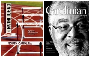
Look for editorial and design inspiration outside the alumni magazine field as well. In a 2014 CASE Editors Forum session dubbed “Divine Inspiration: Where to Find Inspiring Ideas and How to Put Them to Work,” communications strategist Shane Shanks, who recently redesigned the University of South Carolina’s Carolinian, encouraged editors and designers to check out newsstand magazines, retail catalogues, CD covers, and even pulp-fiction novels for inventive visuals and creative ways to tell campus stories.
Middlebury Magazine editor Matt Jennings, for example, publishes a regular one-page “Dialogue” inspired by Esquire’s popular “What I’ve Learned” spread. It features excerpts from conversations between a pair of Middlebury experts debating issues of the day, complete with fun, color-coded speech balloons.
-
Articulate a vision.
Think about what really needs changing. Your book may or may not need a total overhaul; your readership may or may not be ready for that. If the story selection is predictable and the writing is banal, you may need an editorial “refresh,” period. Maybe the words are working, but competing fonts, bad photography, and inconsistent experience levels among designers translate into a schizophrenic layout. A design refresh resulting in an enduring style template may be what you need. In articulating your vision for the book—which will no doubt be useful in building buy-in among administrators and staff—list, in priority order, three to five problems that you want (and expect) the magazine redesign to solve.
-
Define the scope of work.
I’ve returned again and again to a scope-of-work letter written many years ago by my friend and colleague Tina Hay, editor of the perennial CASE award-winning The Penn Stater. Tina graciously gave me permission to share the letter here. Feel free to adapt it for your needs.
-
Vet designers.
Designers experienced in editorial work are more likely to “get” what you are trying to accomplish, and are used to working within the parameters of an established editorial architecture and design template. Better still, an agency or individual experienced in working with college and university magazines will understand the nature of the approval process and the campus politics that may affect editorial decisions and design direction. Check out our short list of designers recommended by Lane Press customers.
Planning and executing a magazine redesign can be one of the most rewarding experiences you’ll have as a member of an alumni magazine team, and it’s worth the time and effort to do it right. I’d love to hear about what you try and how it works. Email me at [email protected].


